
Background
This was a school project to create a 30 second animated commercial using a brand of our choice.
About
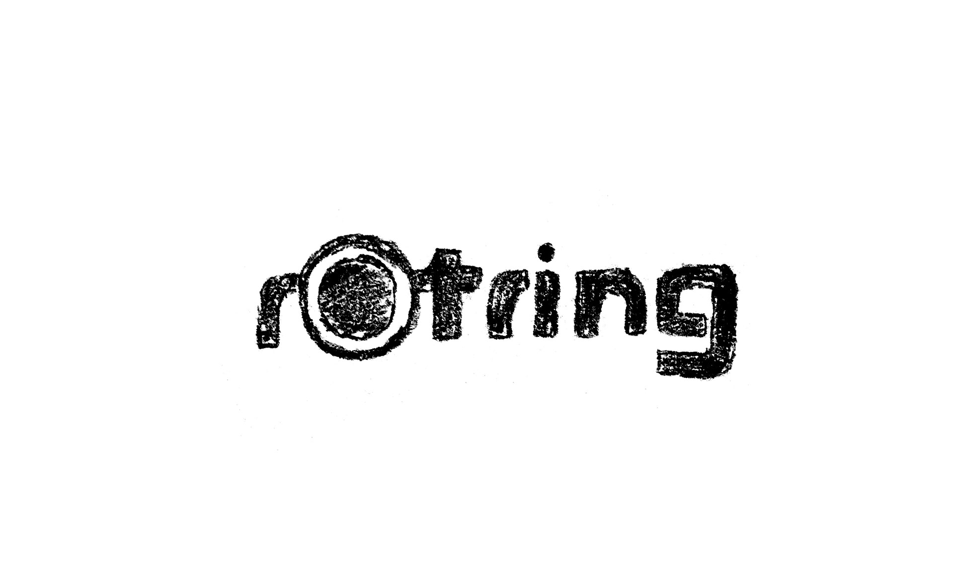
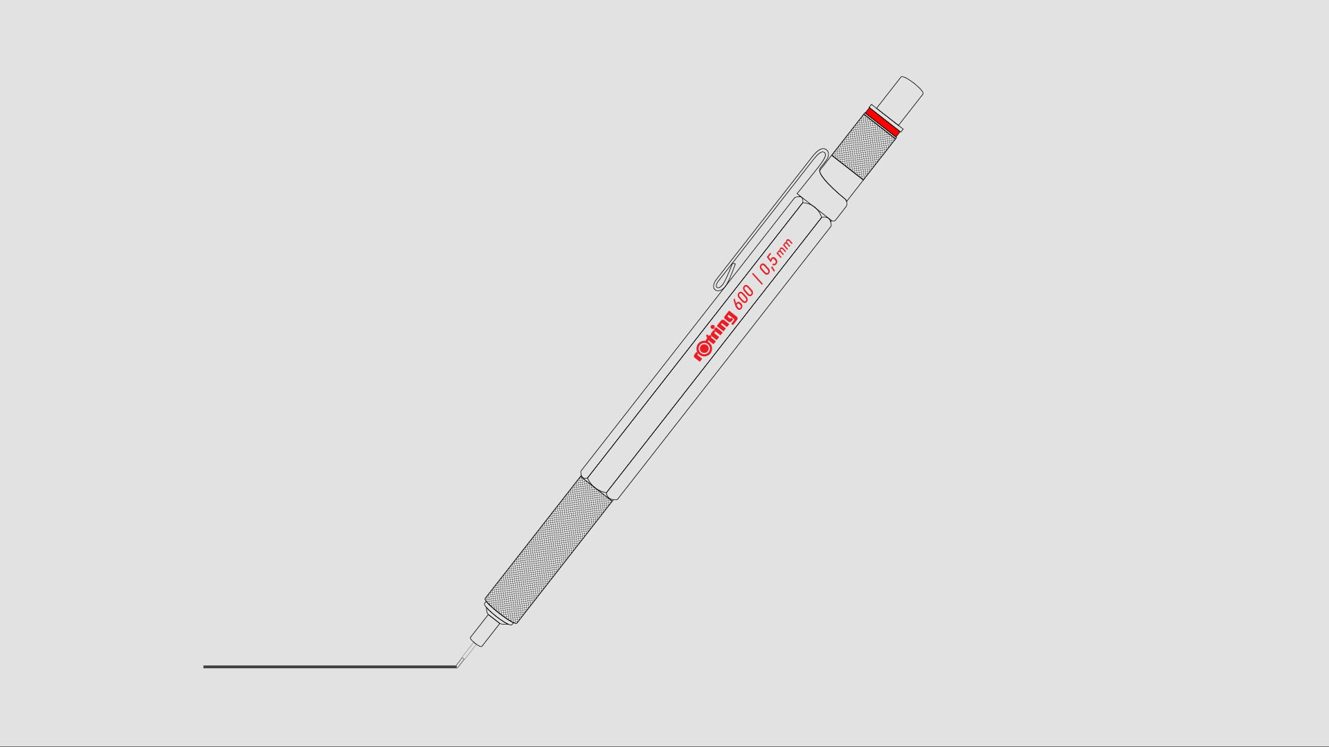
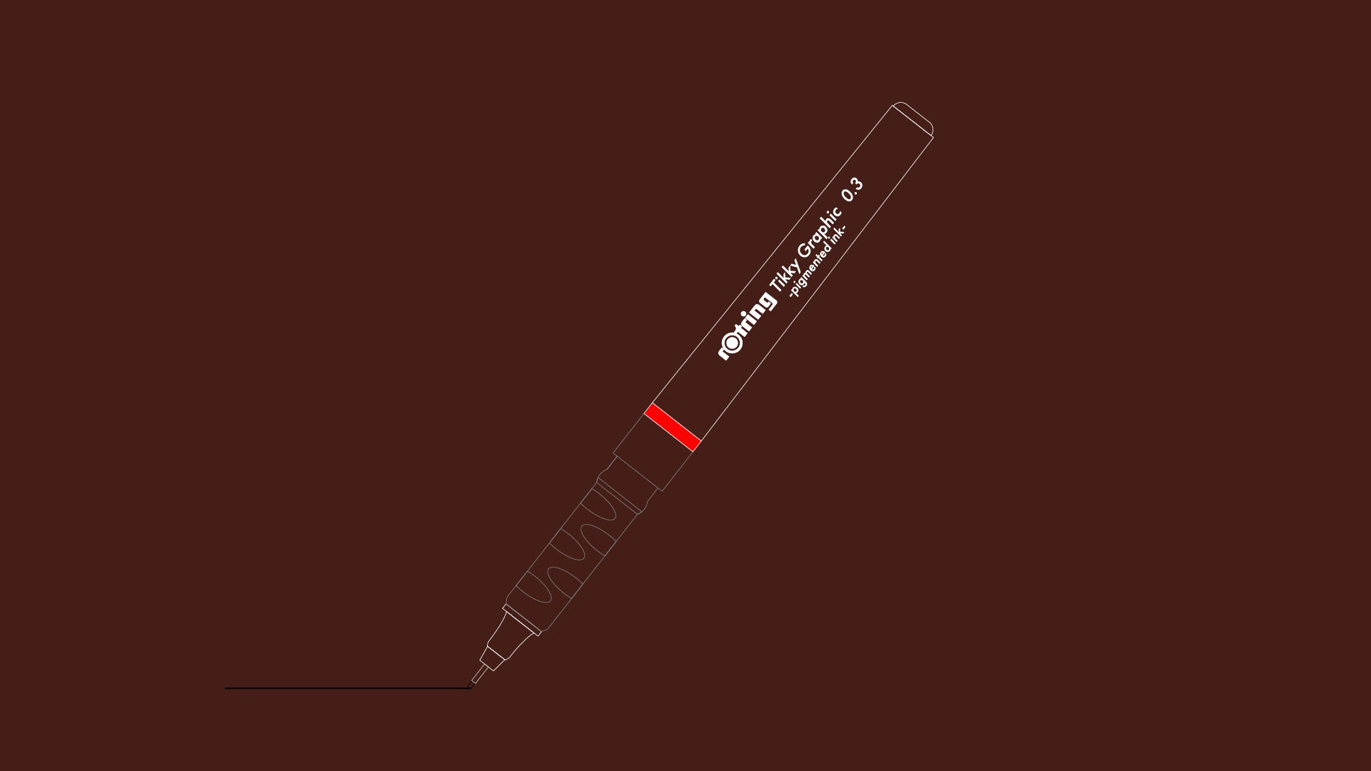
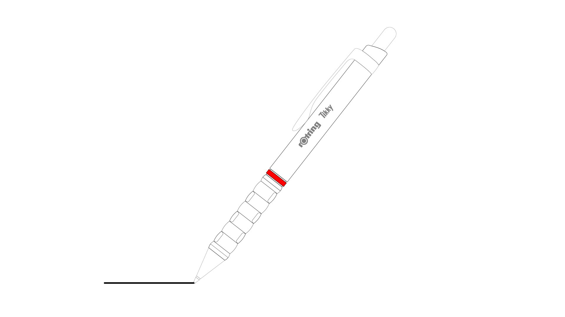
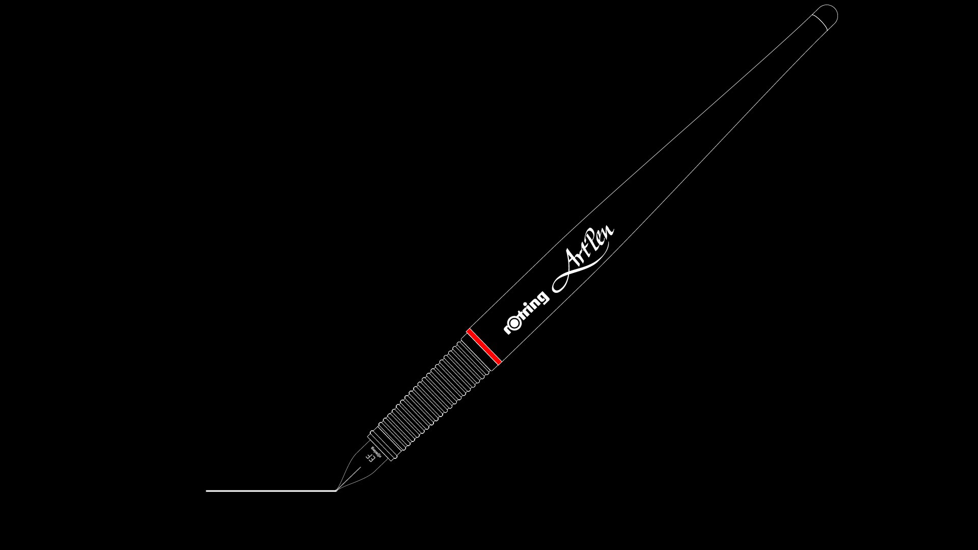
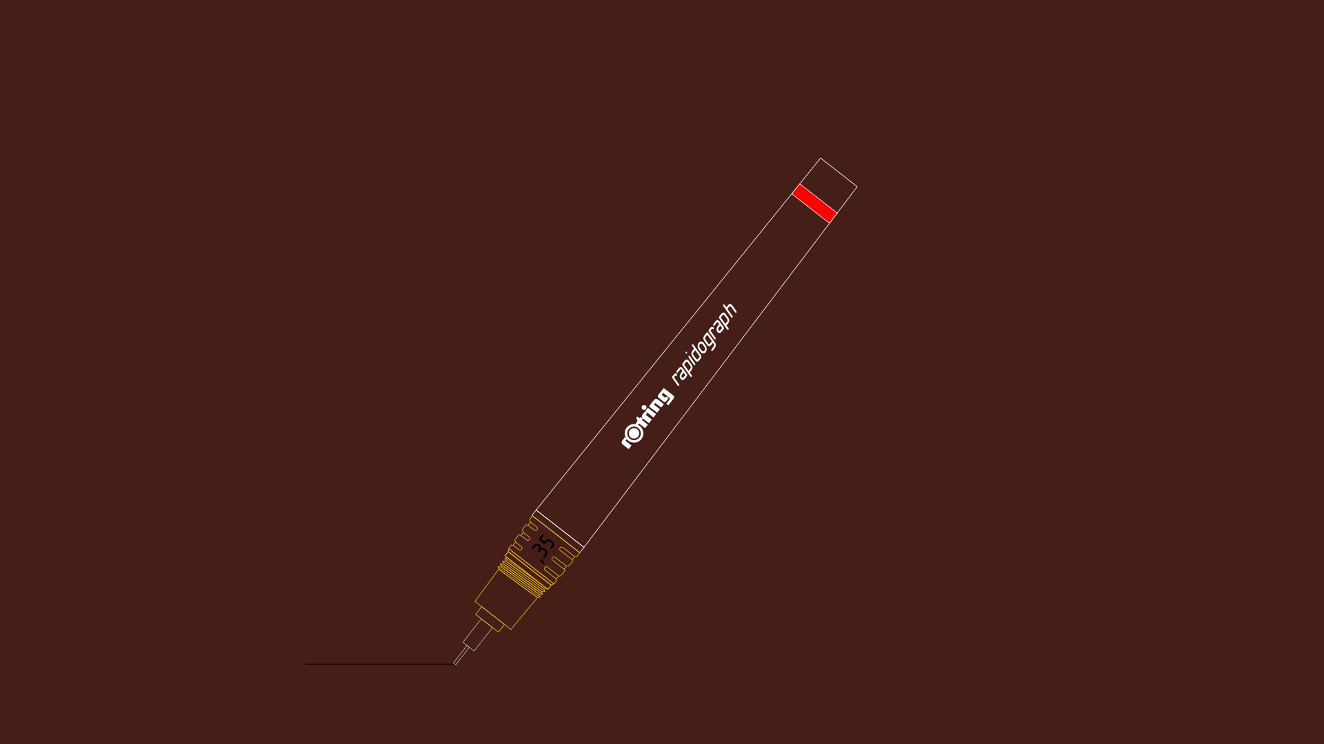
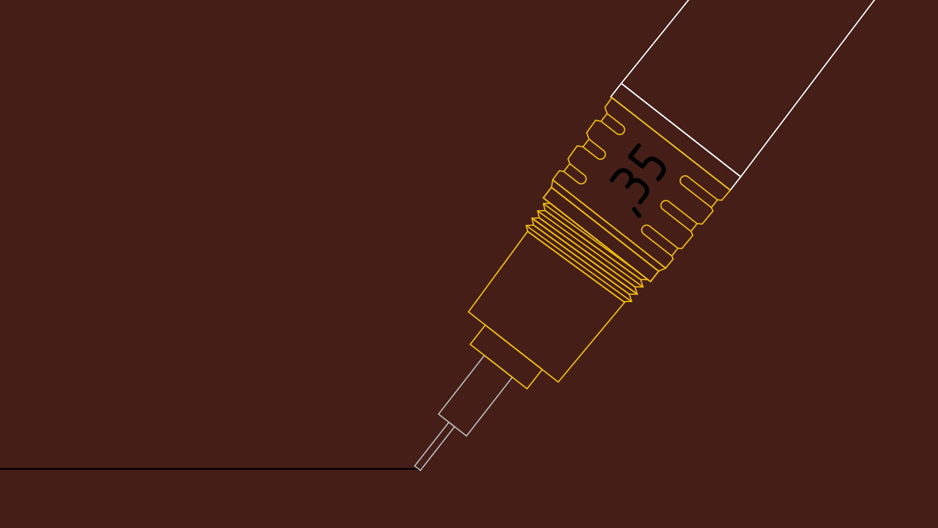
rOtring
rOtring®, innovators of technical pens, mechanical pencils and art and calligraphy instruments, is the brand used by people who value the power of ideas and visions and who strive to give these the highest form of expression. The brand’s focus is precision and quality tools to express creativity in sketching, writing and drawing. rOtring provides consumers – from industrial designers and architects to artists and students – with the best possible product solution for every situation. Every product bearing the red ring is a perfect marriage of ergonomics and design, enabling users to work with precision and bring visionary ideas to life.
Story
Celebrate rOtring’s 90 year history by highlighting the type of work that can be created with their tools reflected by the craftsmanship put into the tools themselves.
Concept
Historically rOtring was famous for their premium technical writing instruments. The hope with this concept would be to reintroduce the brand to a new generation of creatives.
Tone
The brand’s professional and premium brand will be carried through to this concept, with the primary brand colors of black and red (their name translate to red ring in German).
Typography
Reflecting the brand’s heritage as a mid-century german brand, the typography will be geometric sans-serifs (DIN, Futrua) which also has been extended into the standardized stencil hand lettering commonly produced with rOtring’s products (Isonorm).
Approach
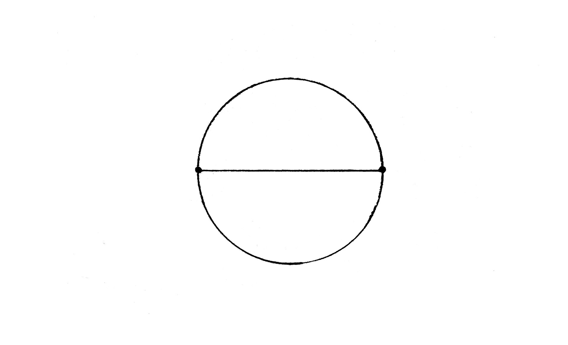
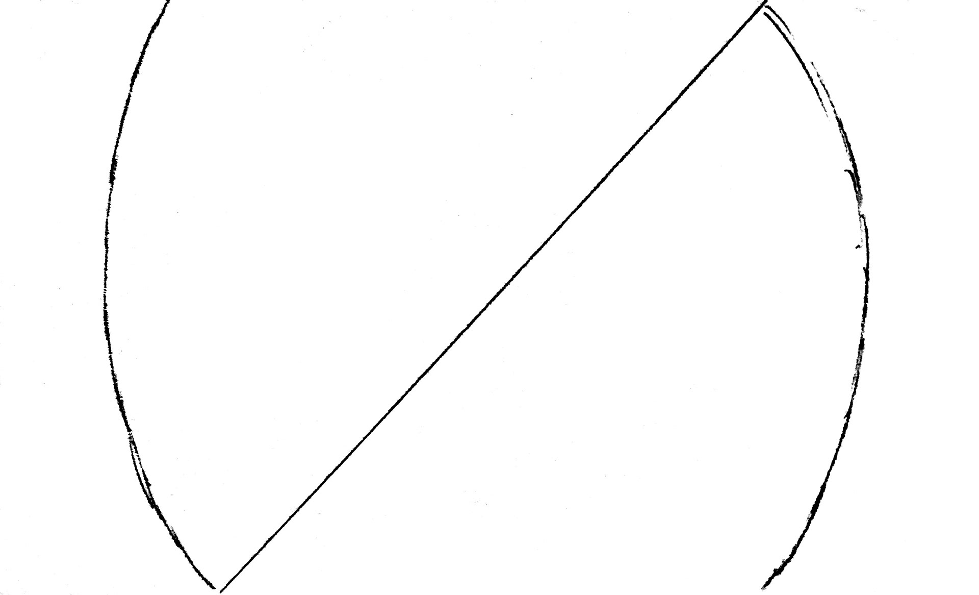
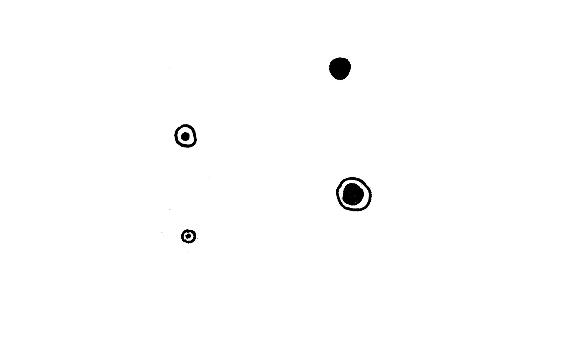
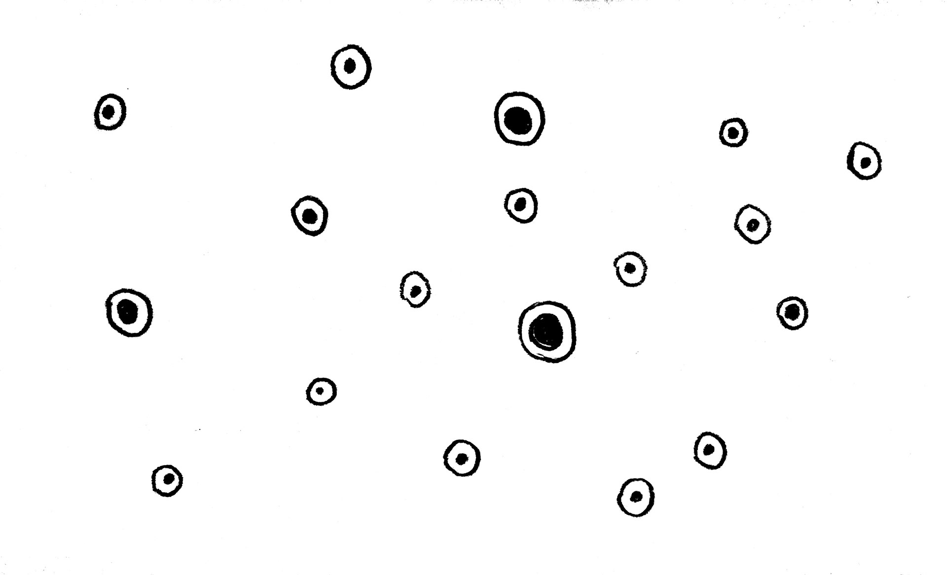
The primary approach that will be taken is to use line drawing animation, and Bauhaus inspired minimalism.
Storyboards

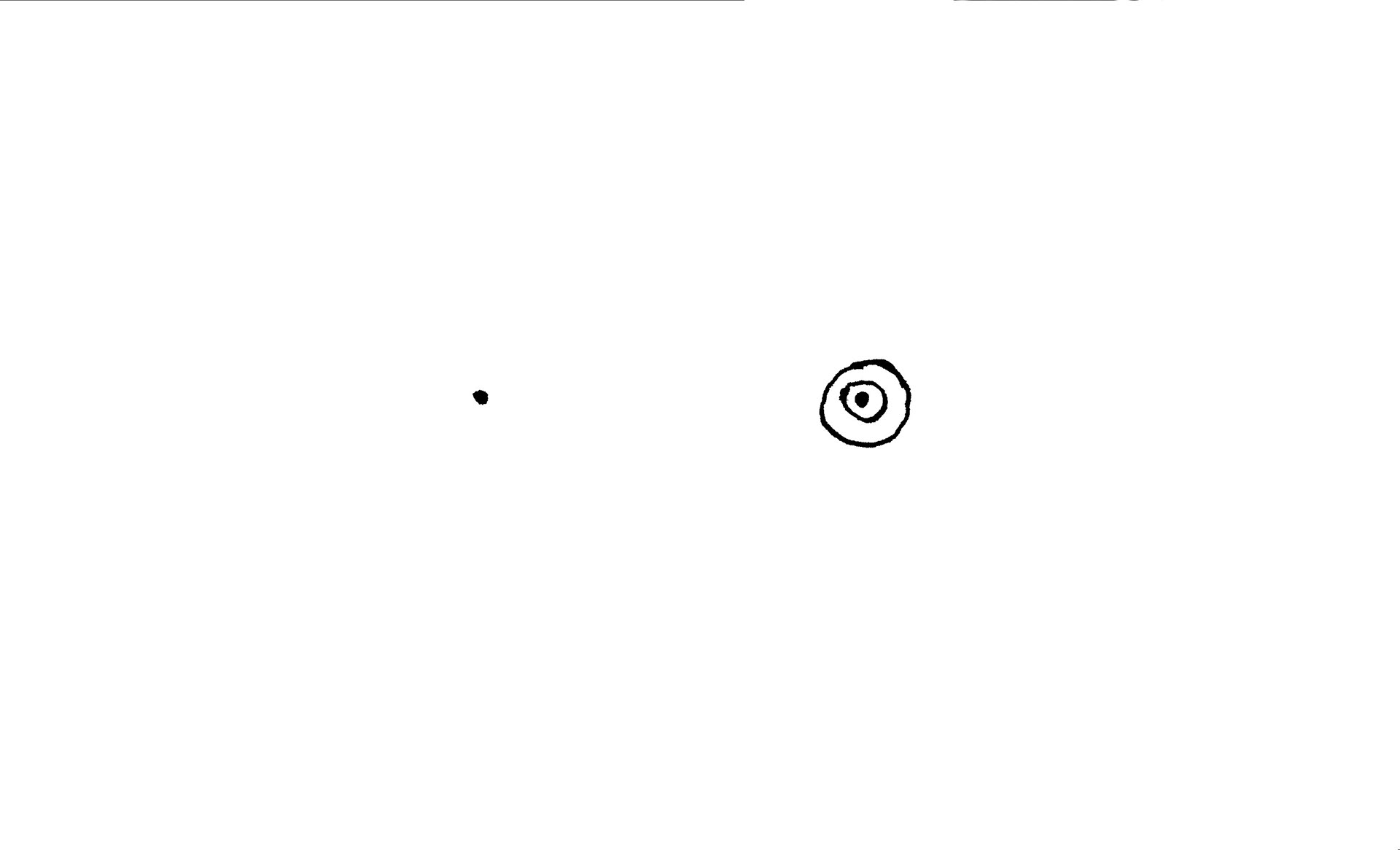


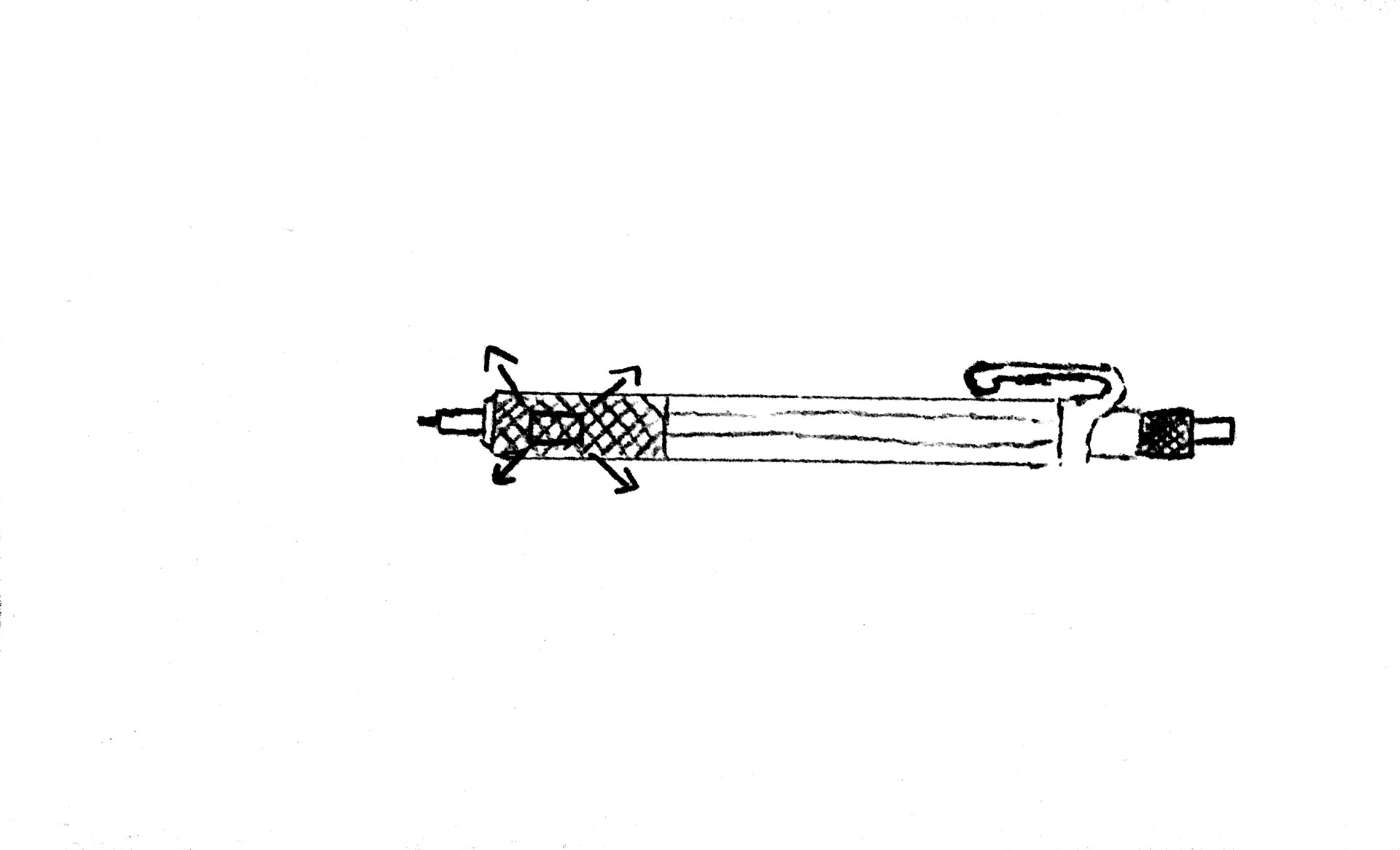
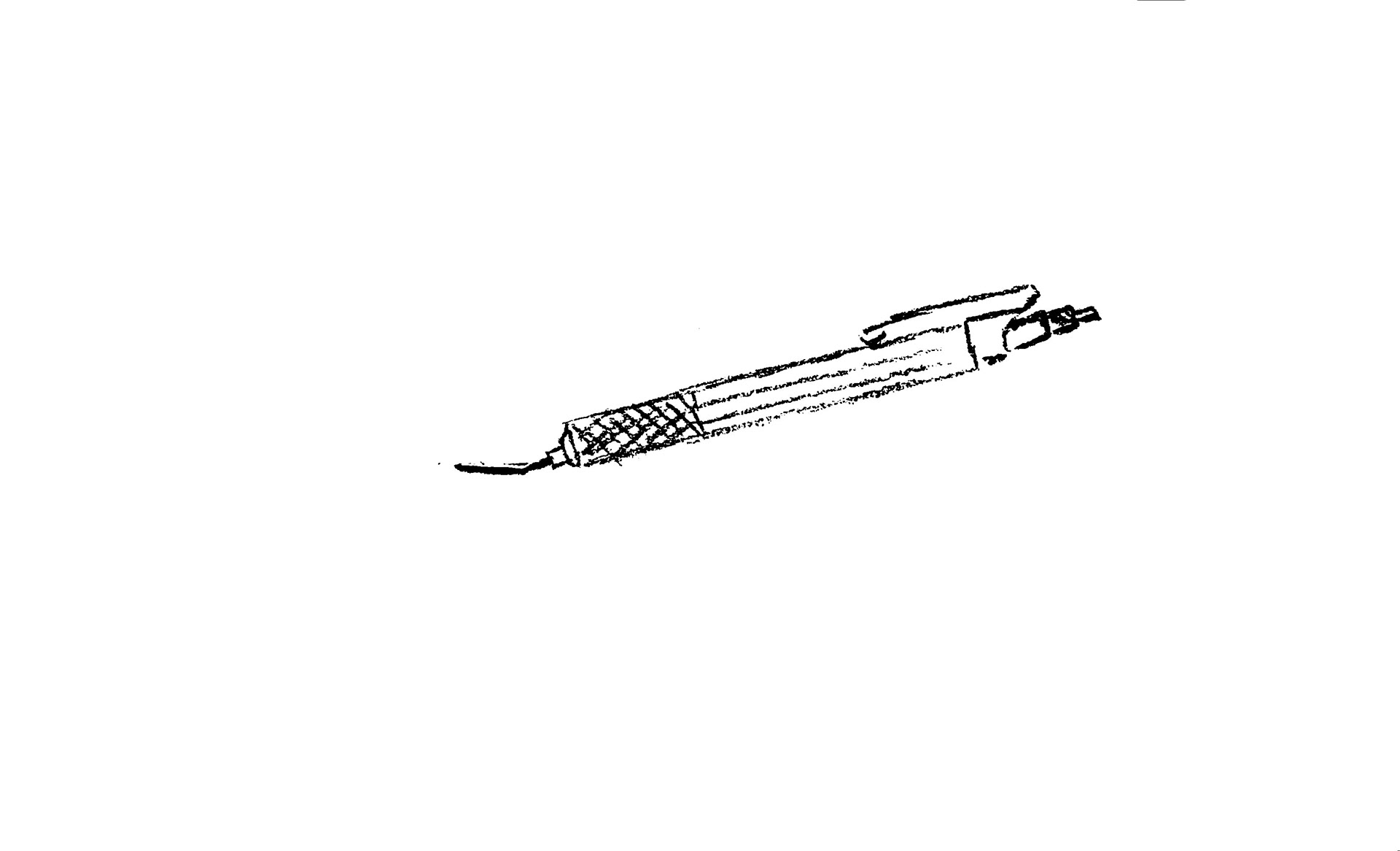
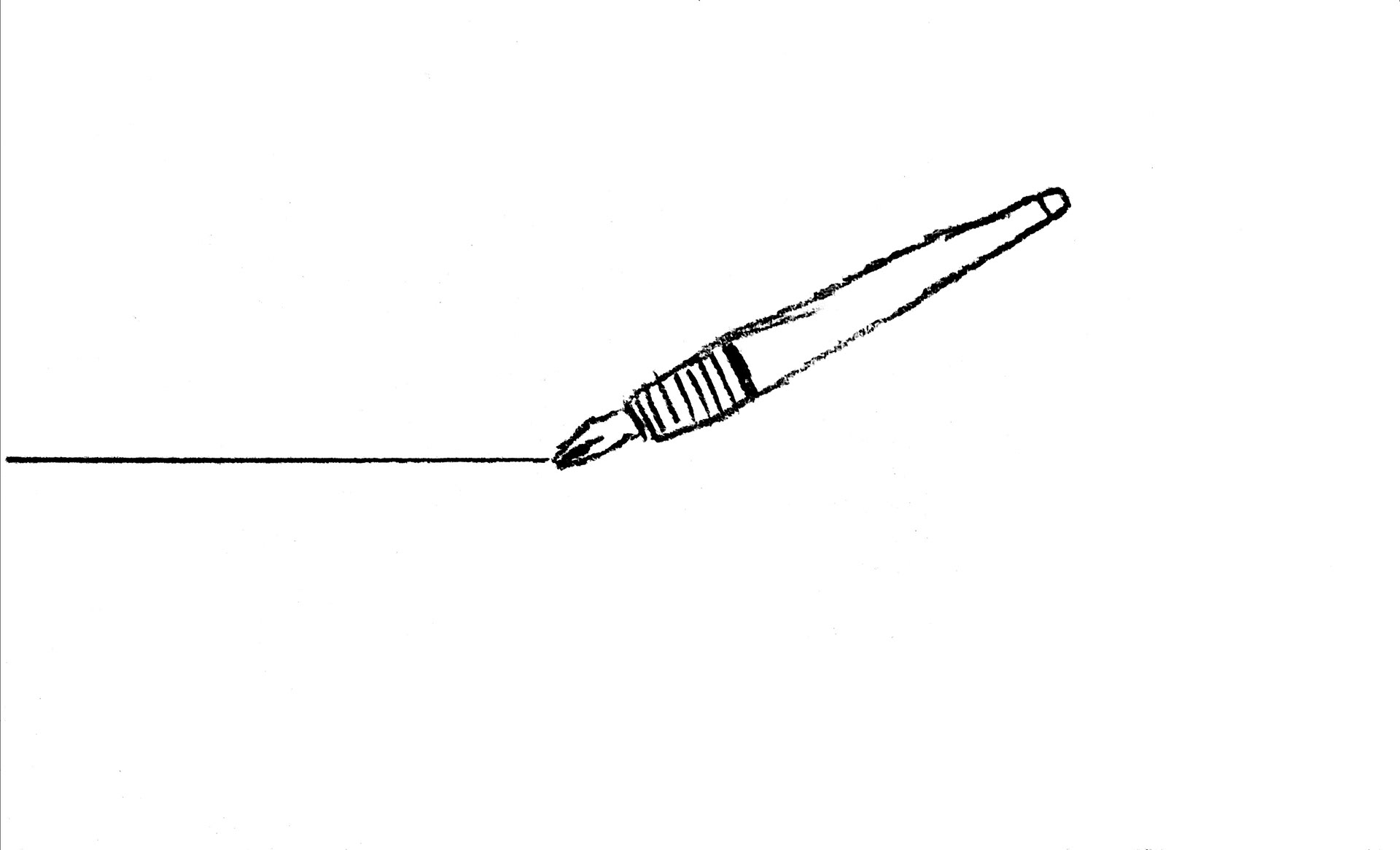
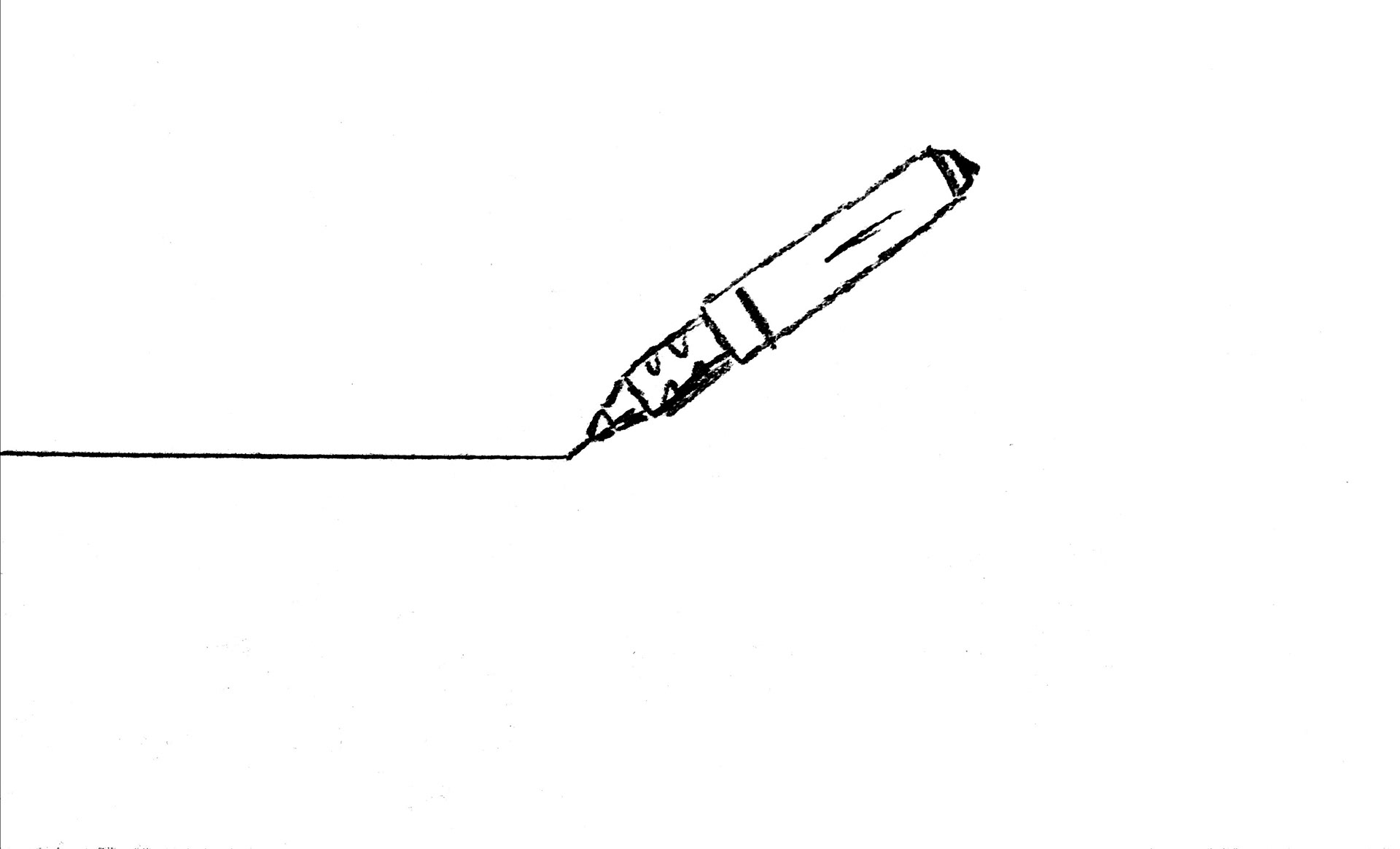
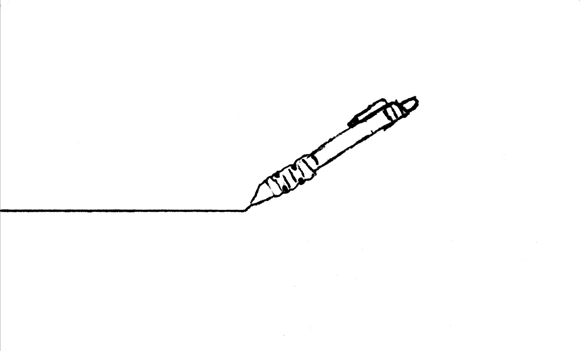
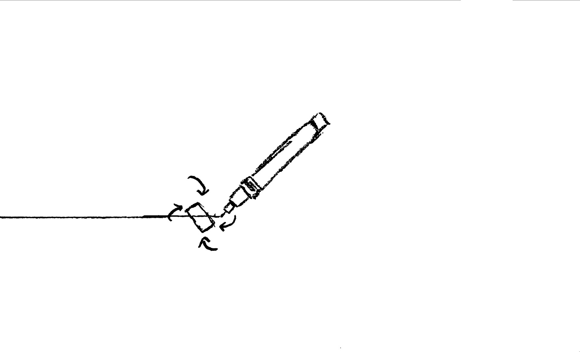


Keyframes


Final Commercial
Disclaimers: The rOtring mark, and products are copyrights of Newell Brands. The illustrations of the products were created for this project.