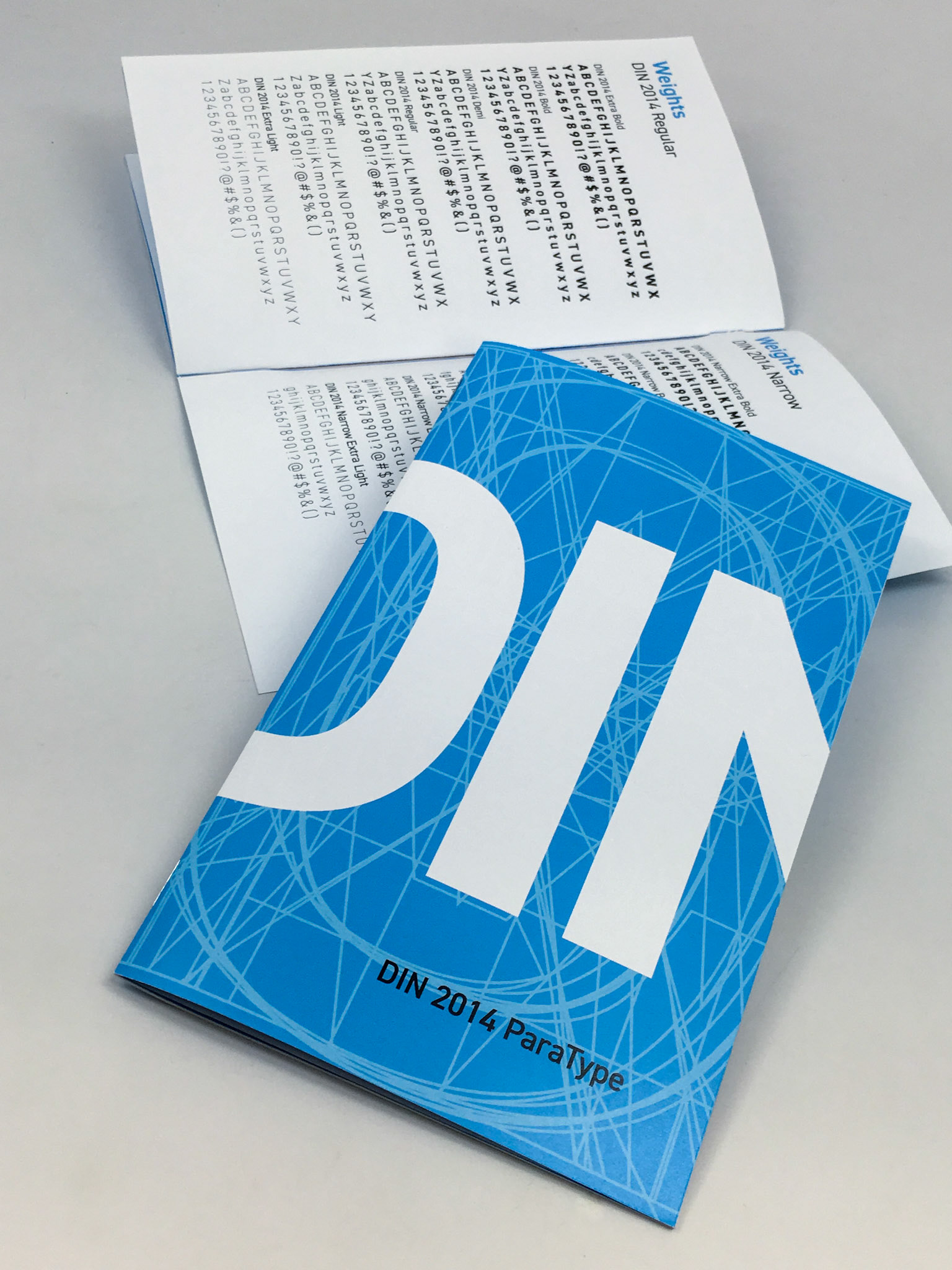
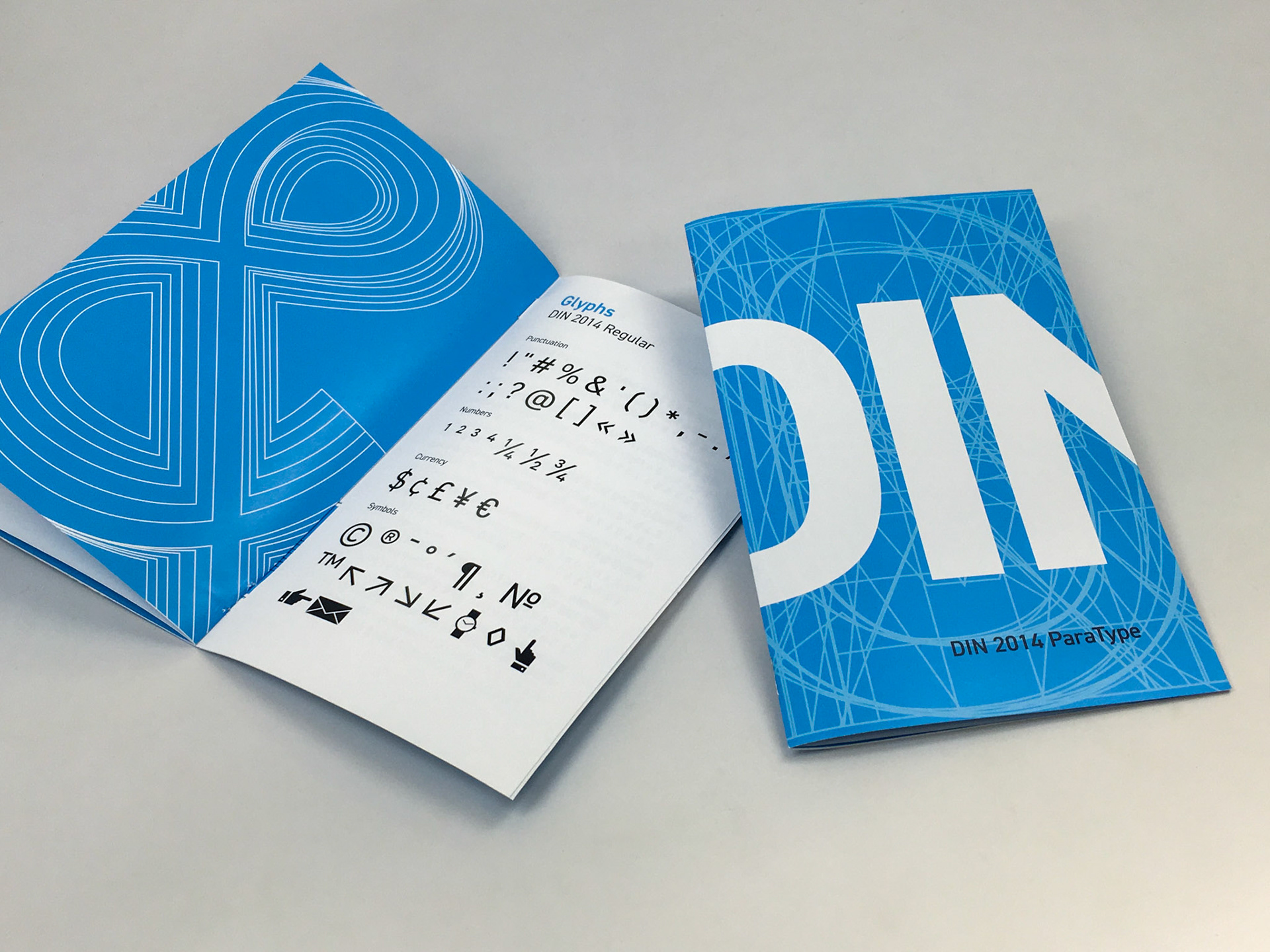
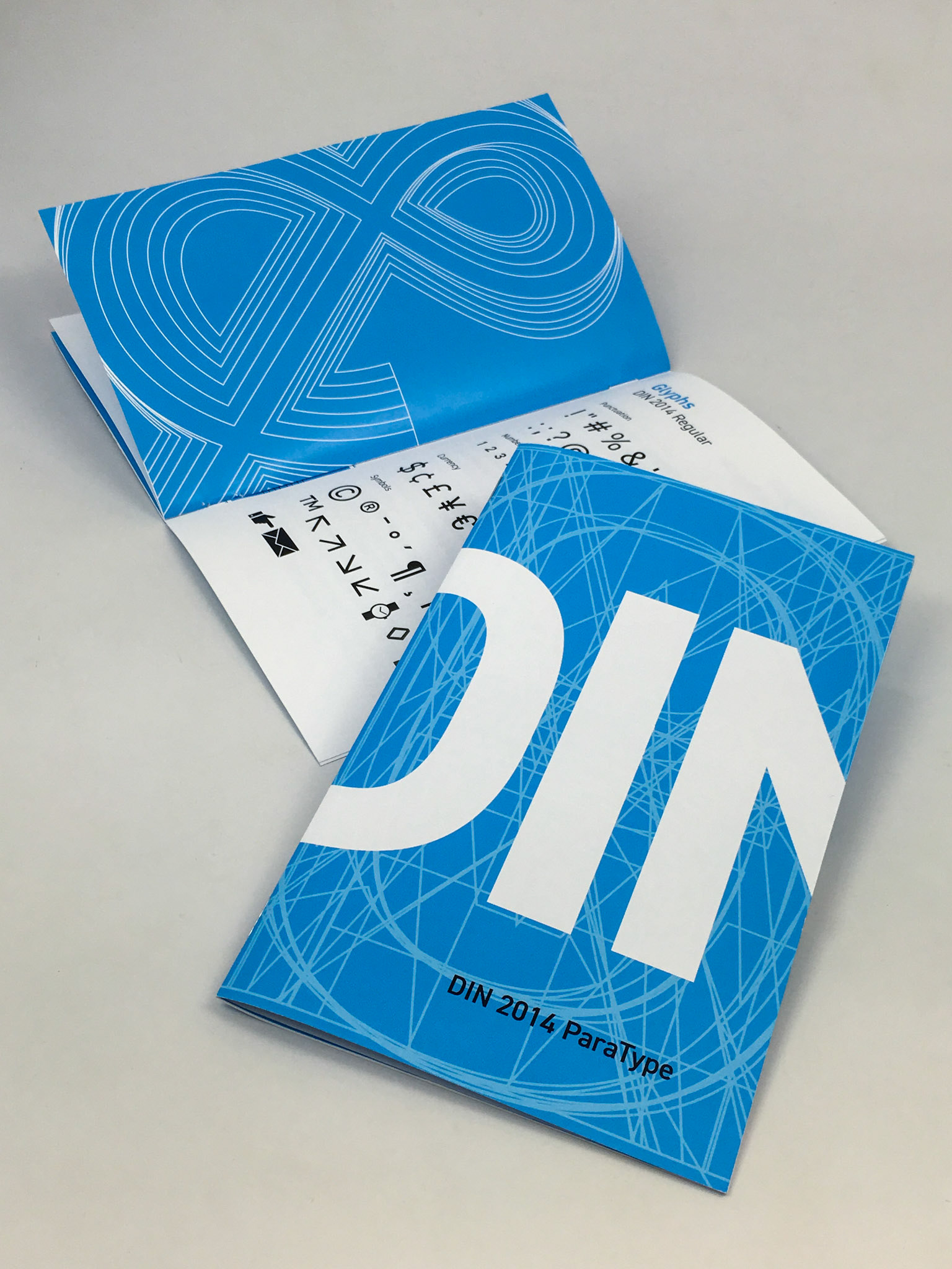
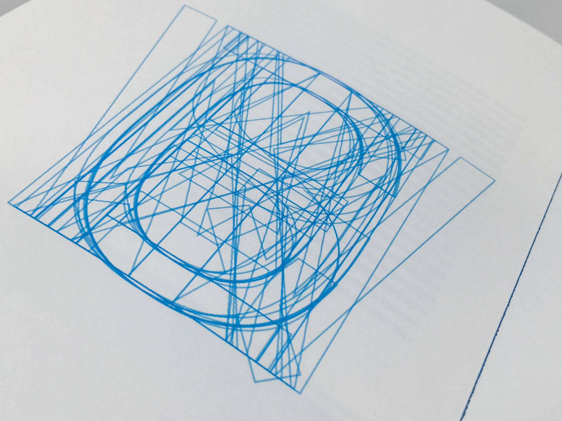
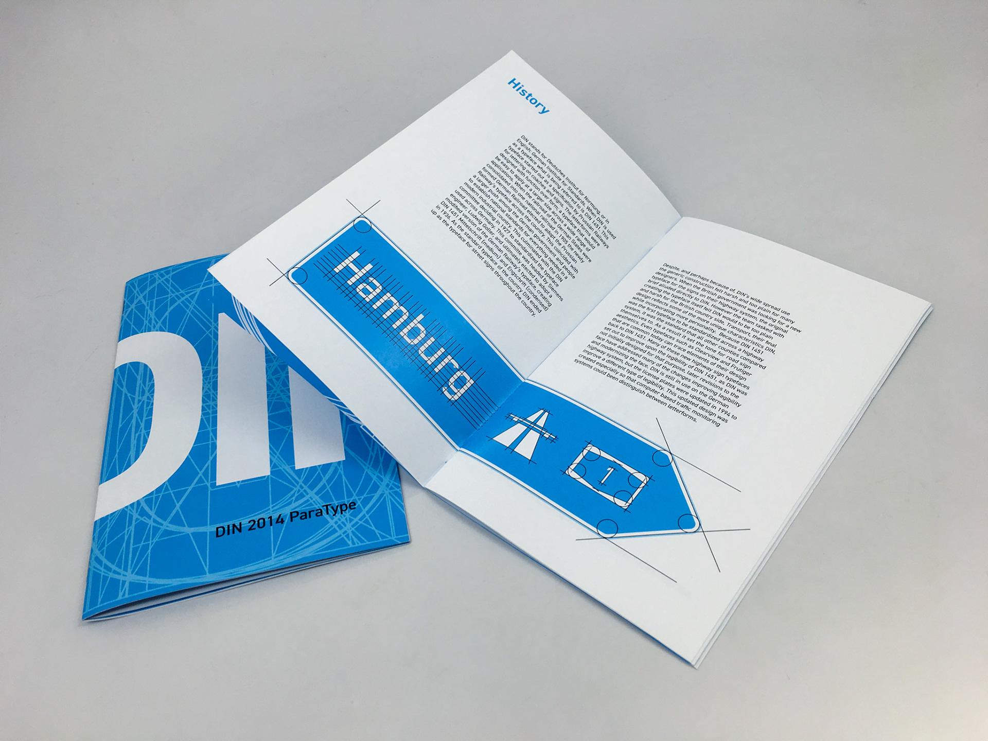
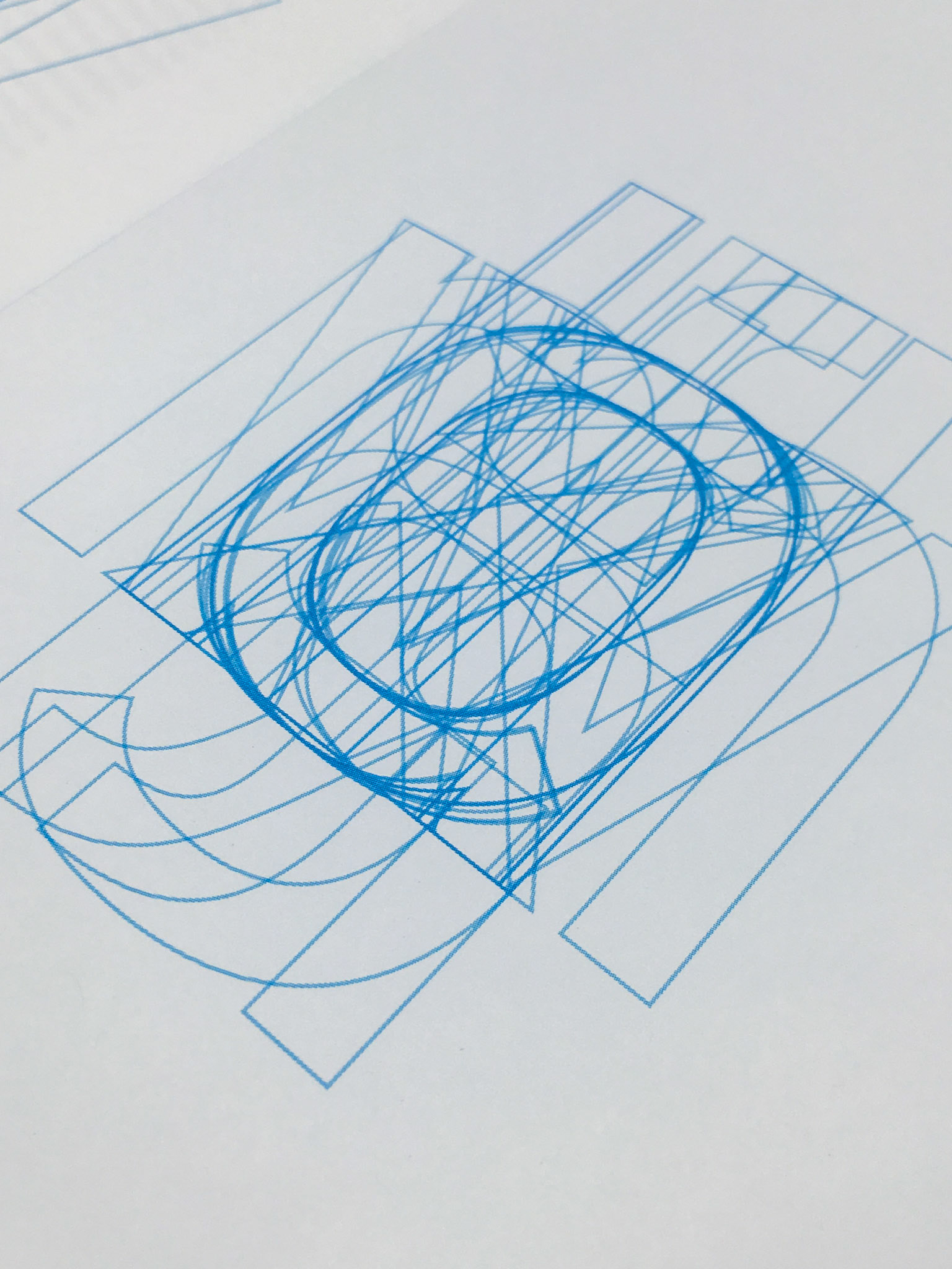
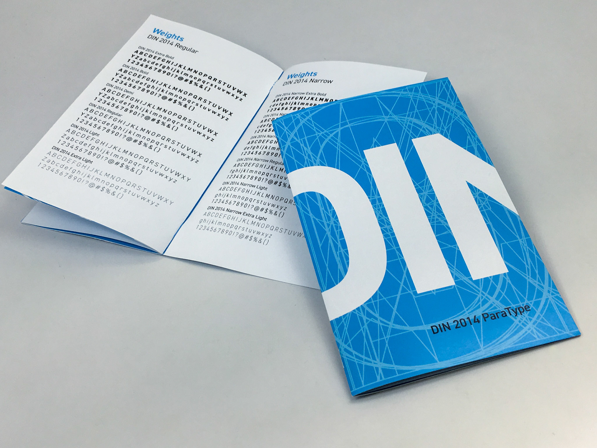
This was a class project to design a type specimen book as a typographic exercise. We were challenged to minimize the number of images included, and instead prioritize the type itself. I choose to do my book on ParaType’s DIN 2014. Like all type specimen books, the goal to demonstrate the potential, and variety offered by a typeface or family. For this booklet I focused on DIN’s geometric construction, and history as a backbone for the specimen itself.
After completing the project for class I wanted to extend it by incorporating a digital component to the project. So I wrote a website that took the same content and converted it to the web.
Full PDF of the book
Photos of the Completed Book
