
About
App: Research Paper Utility
Target Users: Students who are not in research-heavy fields
Target Devices: iPadOS and macOS
Benefits:
• Unified research and writing environment
• Centralized research across multiple databases
• Contextual source suggestions
• Smart source management
• Automatic source formatting
Story
I don’t have to do formal research more than once or twice a year, but when I do it always feels like I am back at square one. Each project requires research into different topics and finding relevant sources for each requires combing through database after database, and book after book. Once I have found a source that I think may be helpful I am stuck with the question of where to put it. With digital sources browser tabs and downloaded files quickly pile up, and determining which sources had the best information at a later date can require almost as much work as gathering the sources to begin with. Physical books also require maintenance and indexing. “Which book had that one quote, again?” Once I move on the write phase these organizational problems are just exacerbated as I am looking for quicker access to that one fact in whatever document I don’t have. Tracking sources while writing is further complicated by needing to provide in-text citations and/or footnotes. Many word processors have the ability to manage footnotes, and some even have features to generate a bibliography. But these features do not associate the text that is written, the source and bibliography. Different style guides require slightly different formatting for in-text citations, footnotes, and bibliography, which introduces another level of complexity.
Flow Diagram
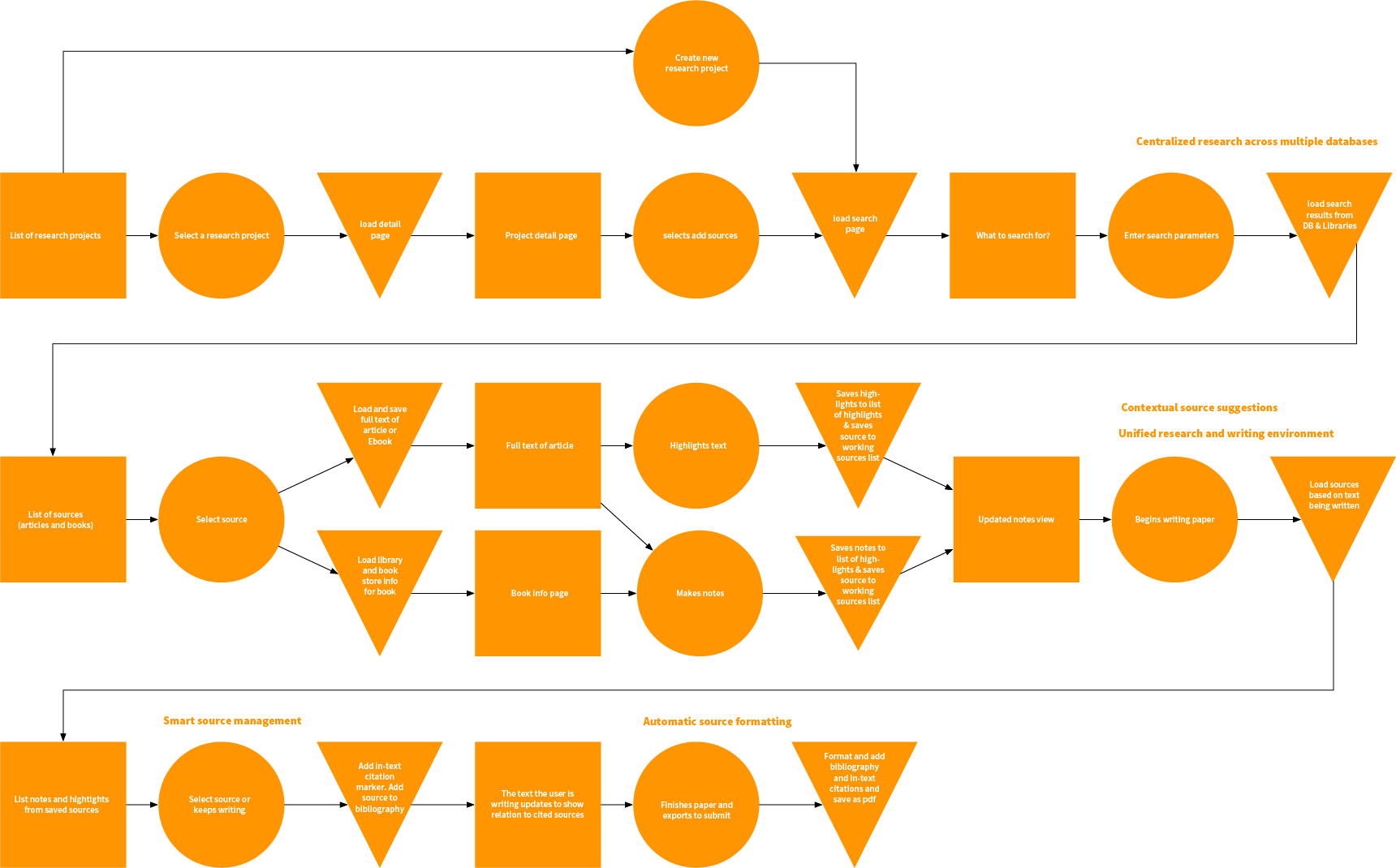
This flow diagram shows how a user would navigate through the application. One challenge that surfaced in this project was the open ended nature of content creation apps. Because the primary content of a creation app is what the user inputs, and not a series of single screen views, the user flow is more complex than many other apps. While it is important to understand all the different ways a user can navigate through an open ended app, this divergent flow diagram complicated later steps in the design process.
Storyboards:
Storyboards were created to get an idea for how the application could work, and to provide a prototype that can be used for usability testing.
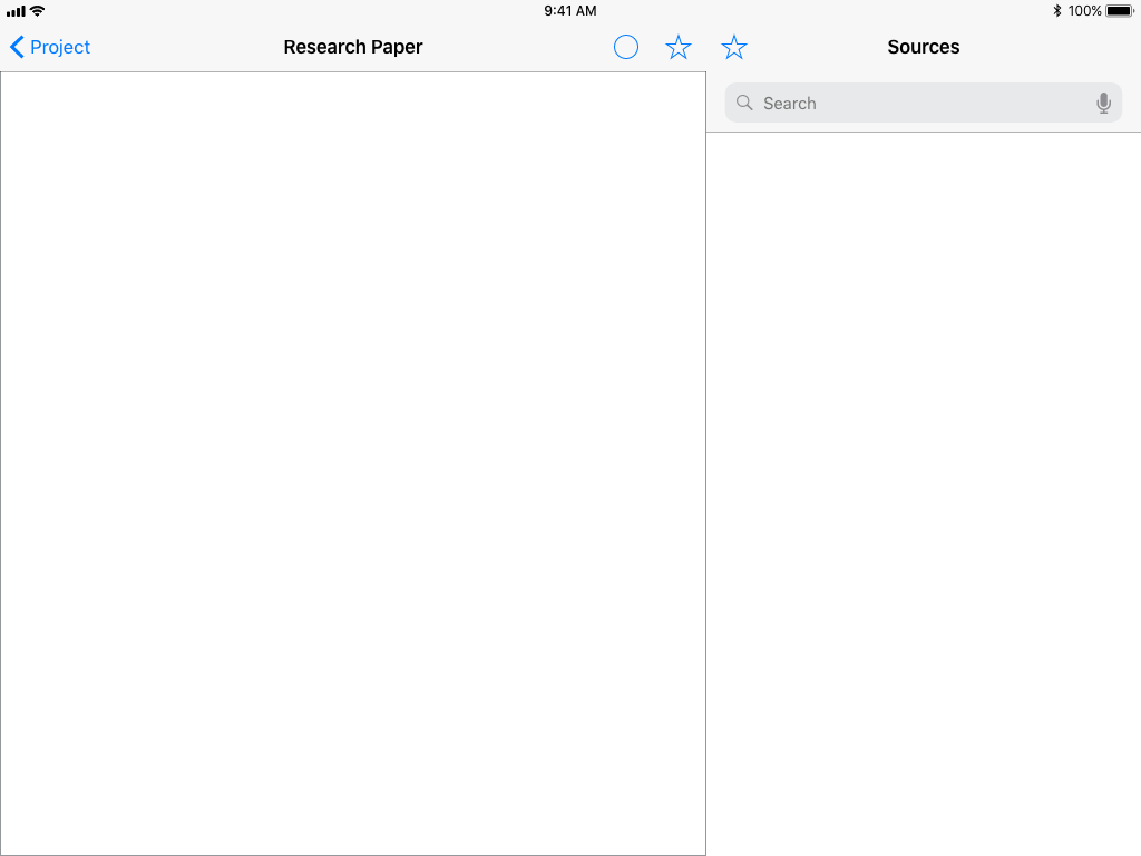
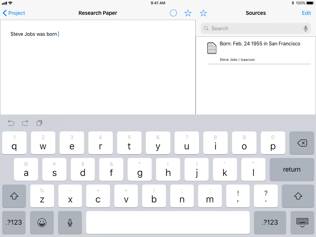
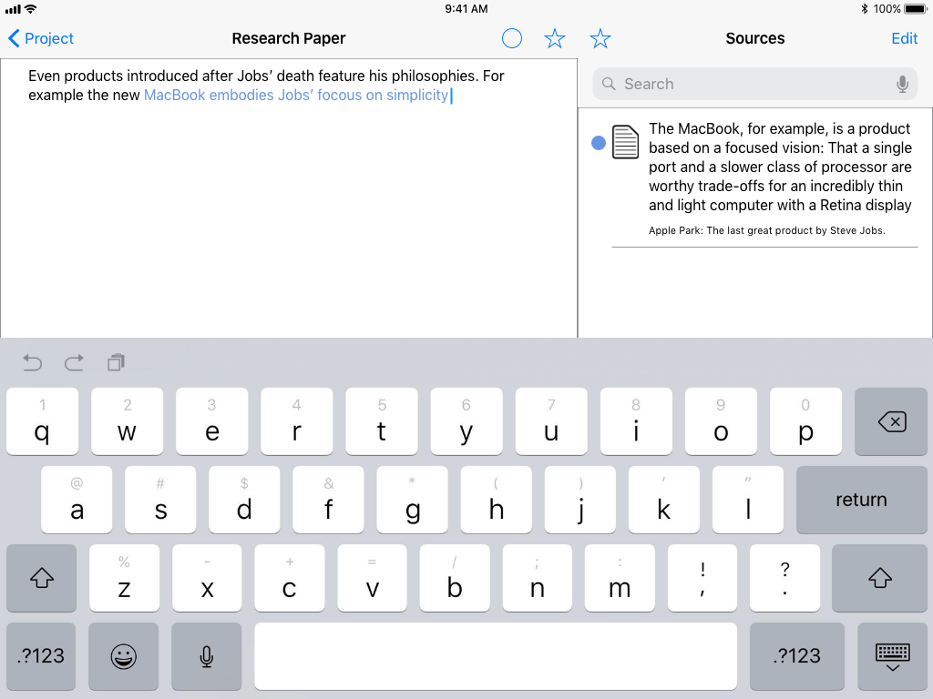
1 Empty project field: After a new project has been created with no content. Tapping the search bar leads to a search of different databases, tapping the empty paper begins writing the paper.
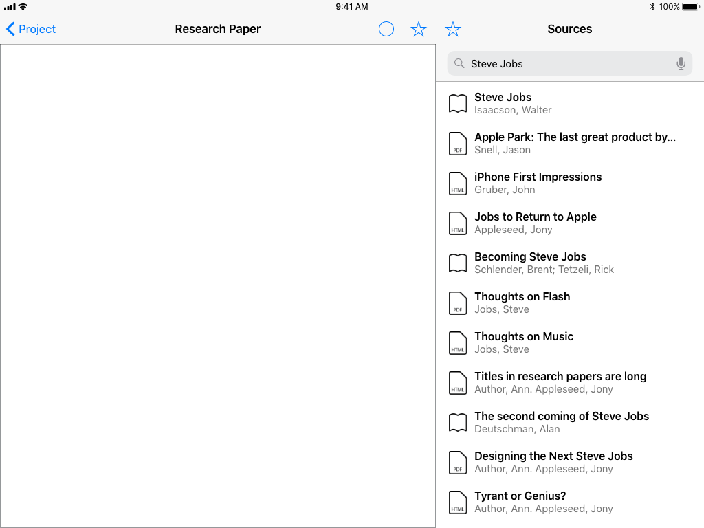
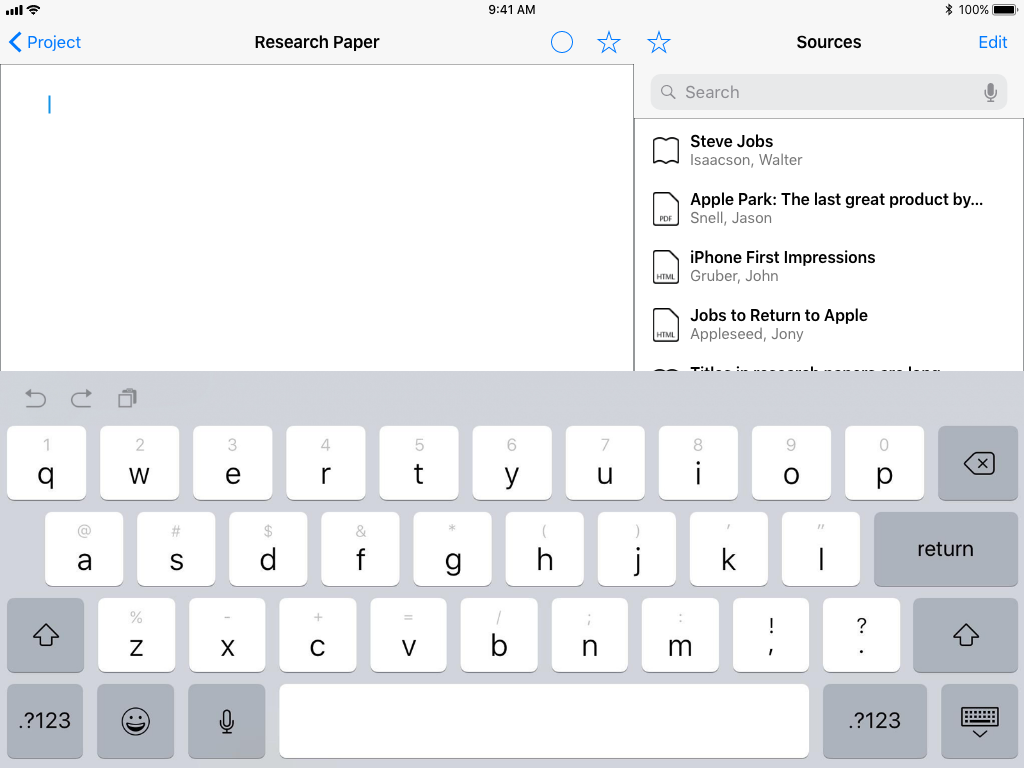
2 List of search results: When the users enters a search term, a collection of sources from different databases are presented in one list. Tapping on an entry leads to an entry detail page
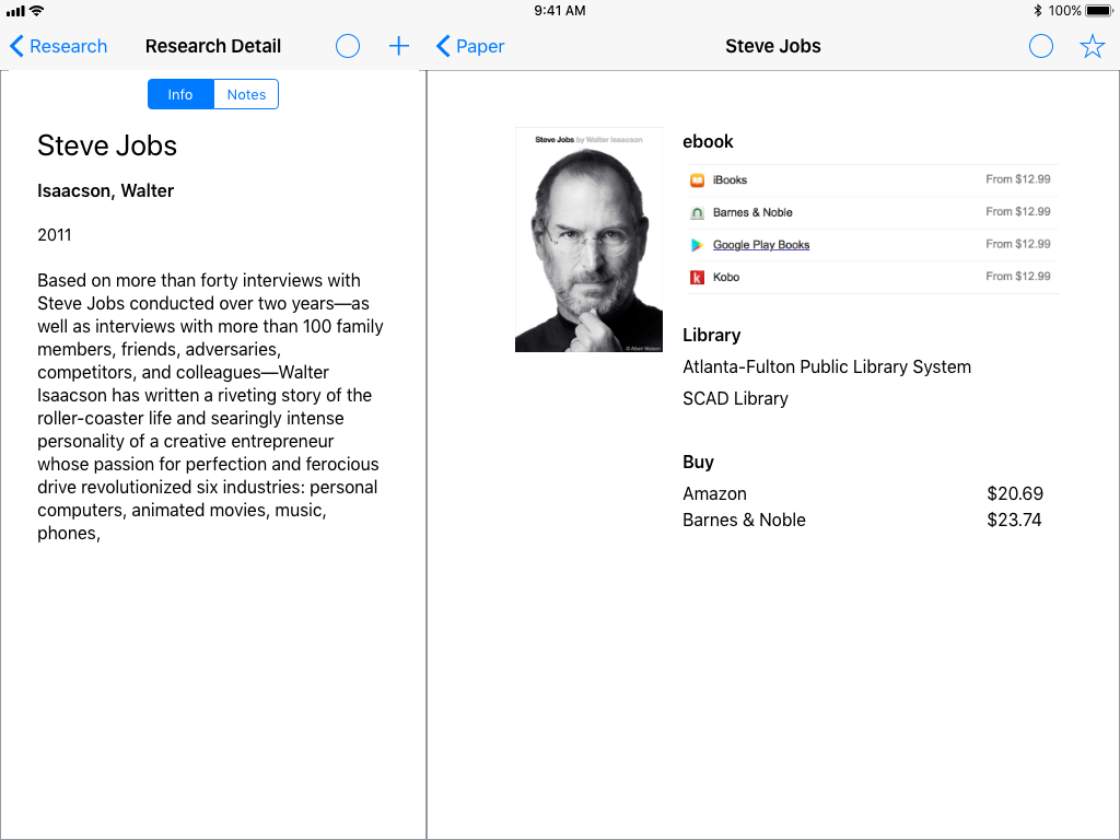
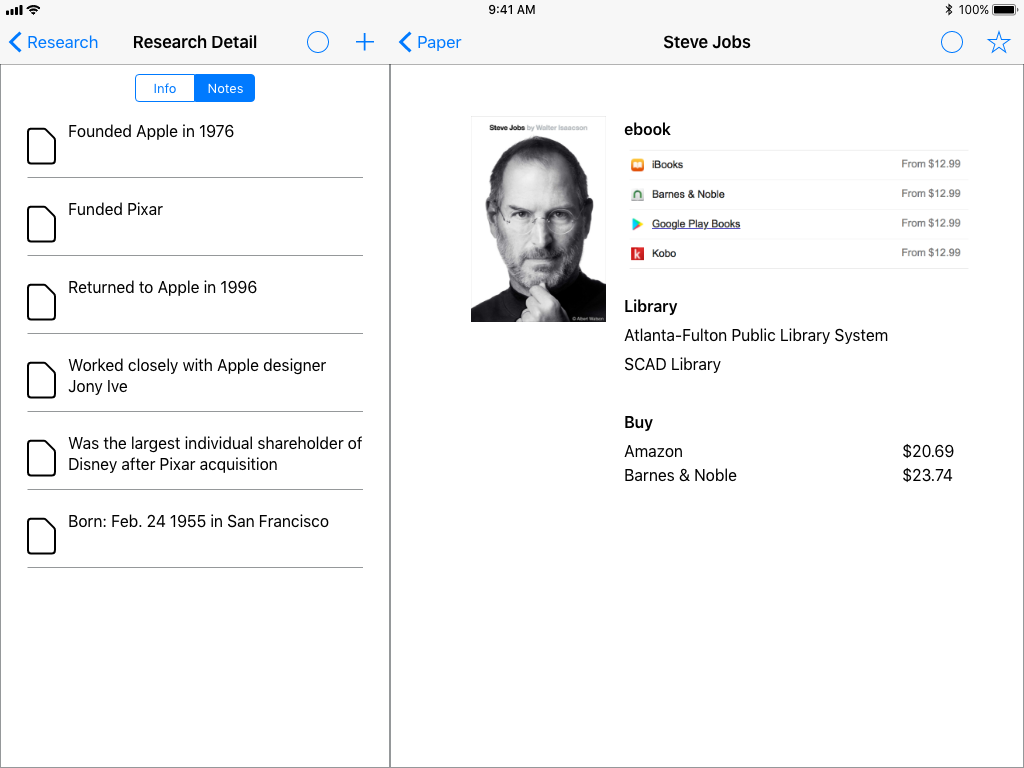
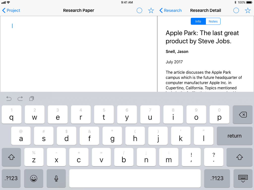
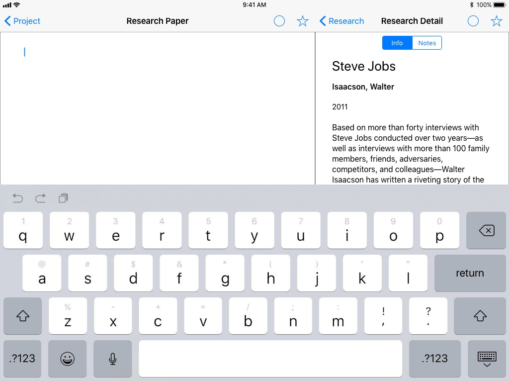
2.1a Book Detail (info): On the book page, the main content is a list of place where you can find the full text (ebook, Libraries, and stores). The side bar has gener- al info about the book. The plus button adds a note about the book
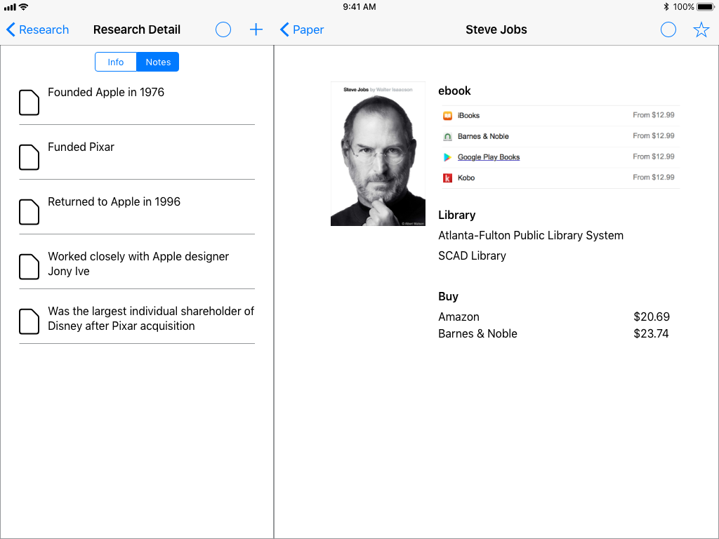
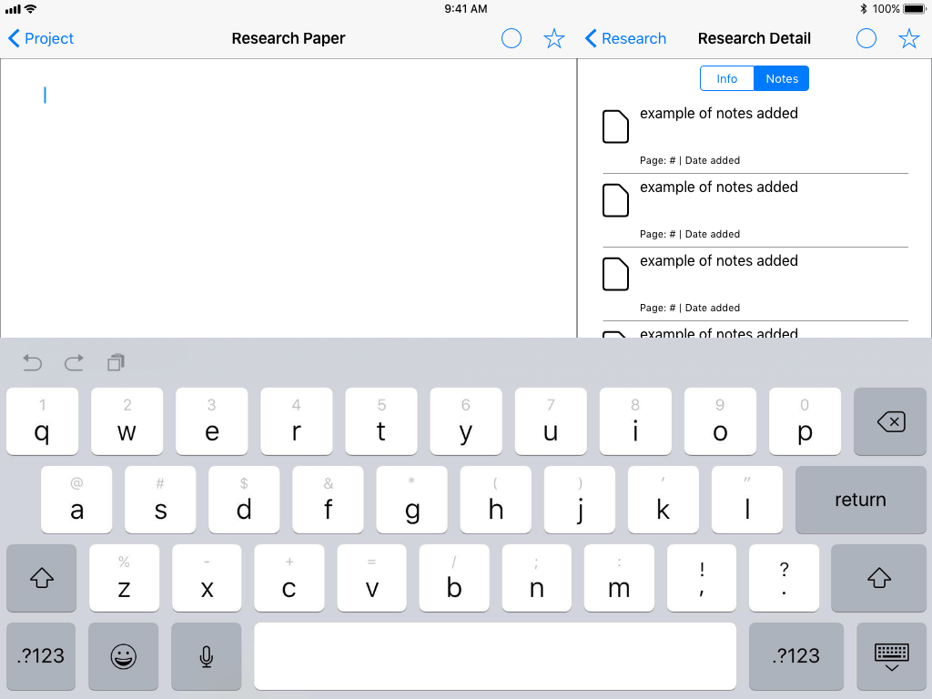
2.1b Book Detail (notes): On the notes view in the side bar there are a list of notes that the user has added. The plus but- ton adds a note about the book.
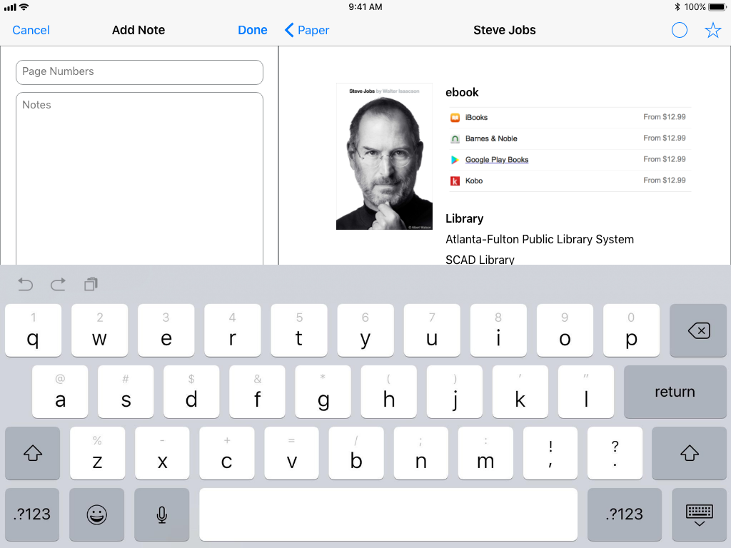
2.1i Add Note: After tapping on the add note button, a field is presented that lets the user add the page number and their notes about the book.
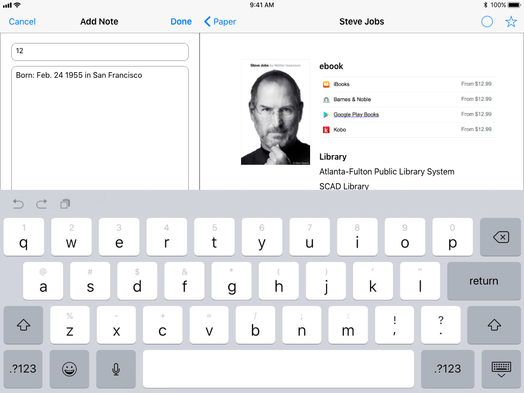
2.1ii Note Contents: Illustrates what the notes fields look like filled.
2.1iii Note Added: After creating a note, the note appears in the list of notes in the sidebar
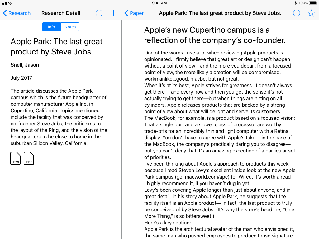
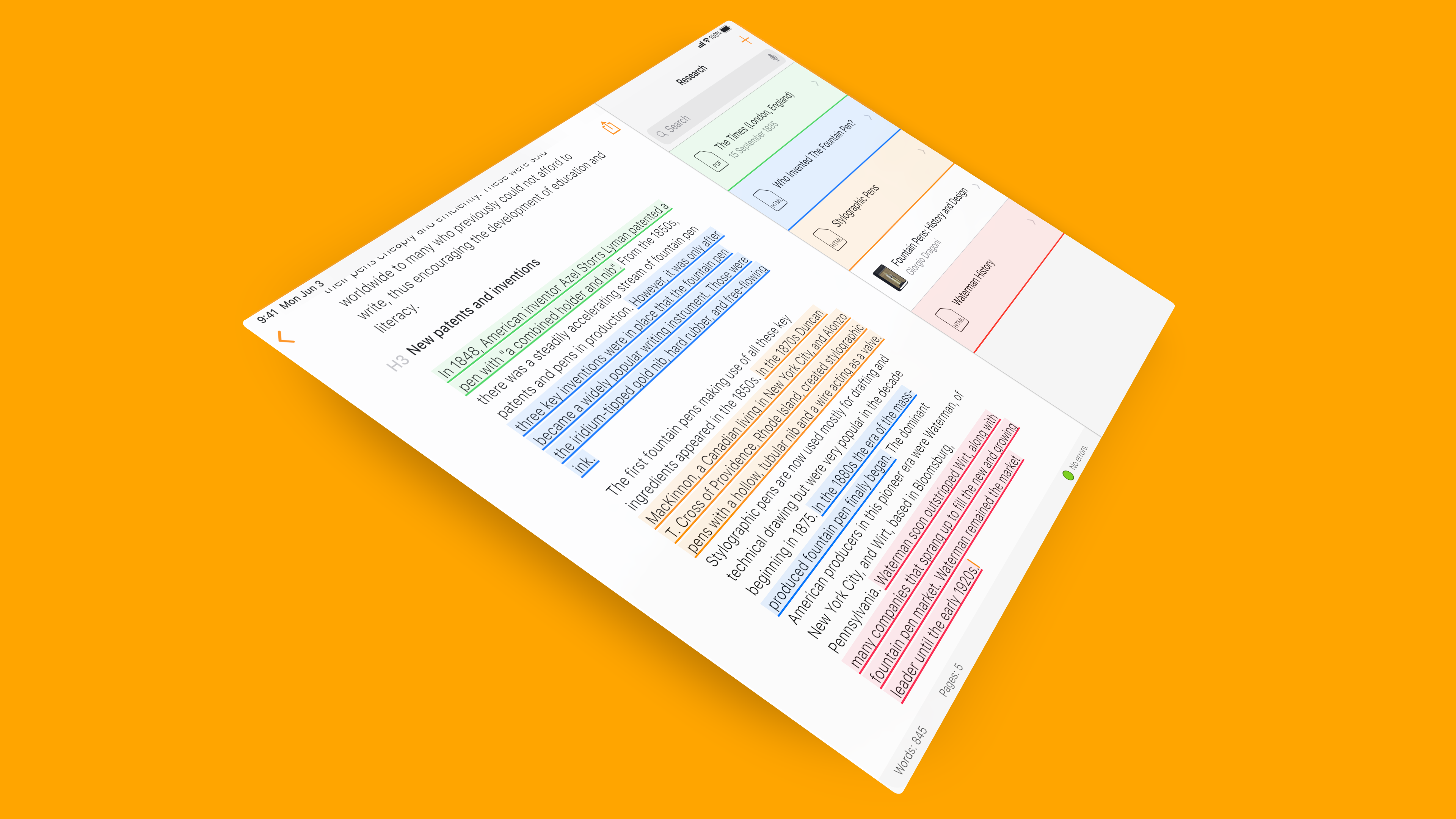
2.2a Full Text (info): For articles where the full text is available. Showing the info sidebar. Highlighting text, or tapping the plus button adds contents to notes
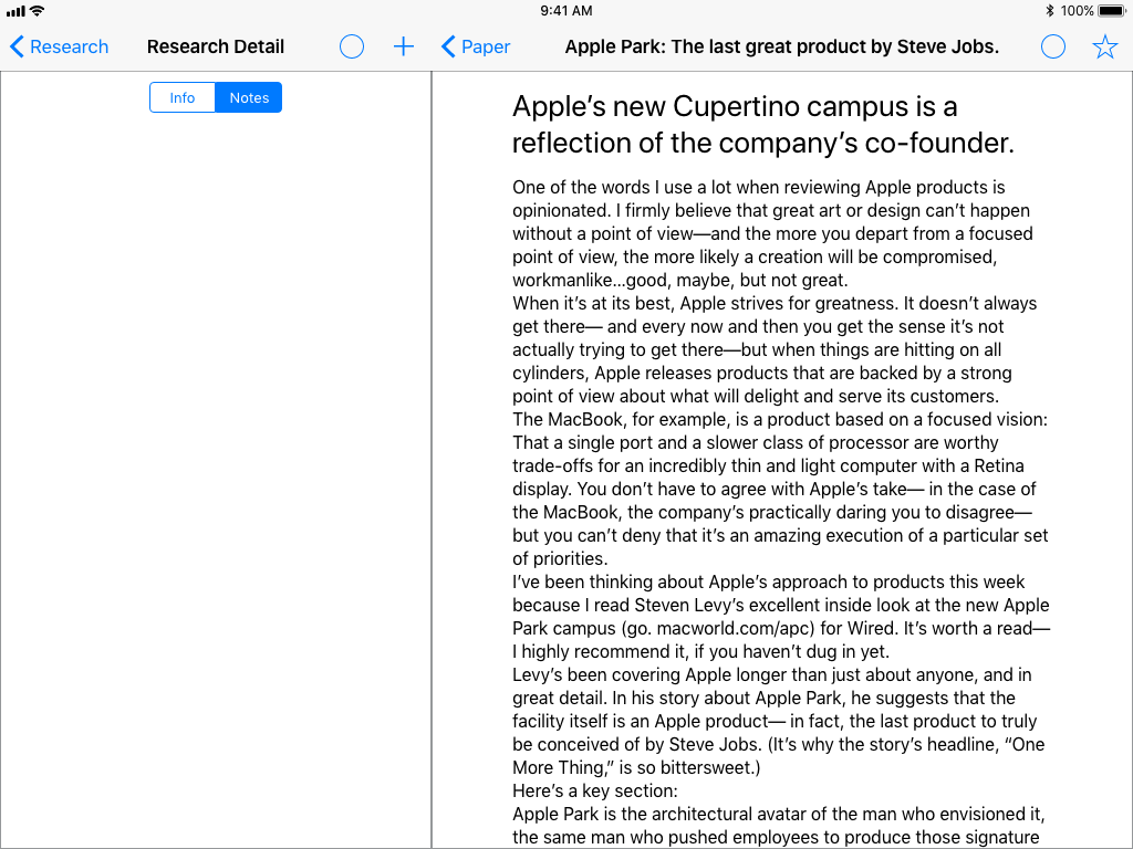
2.2b Full Text (Notes): For articles where the full text is available. Showing an empty notes sidebar. Highlighting text, or tapping the plus button adds contents to notes.
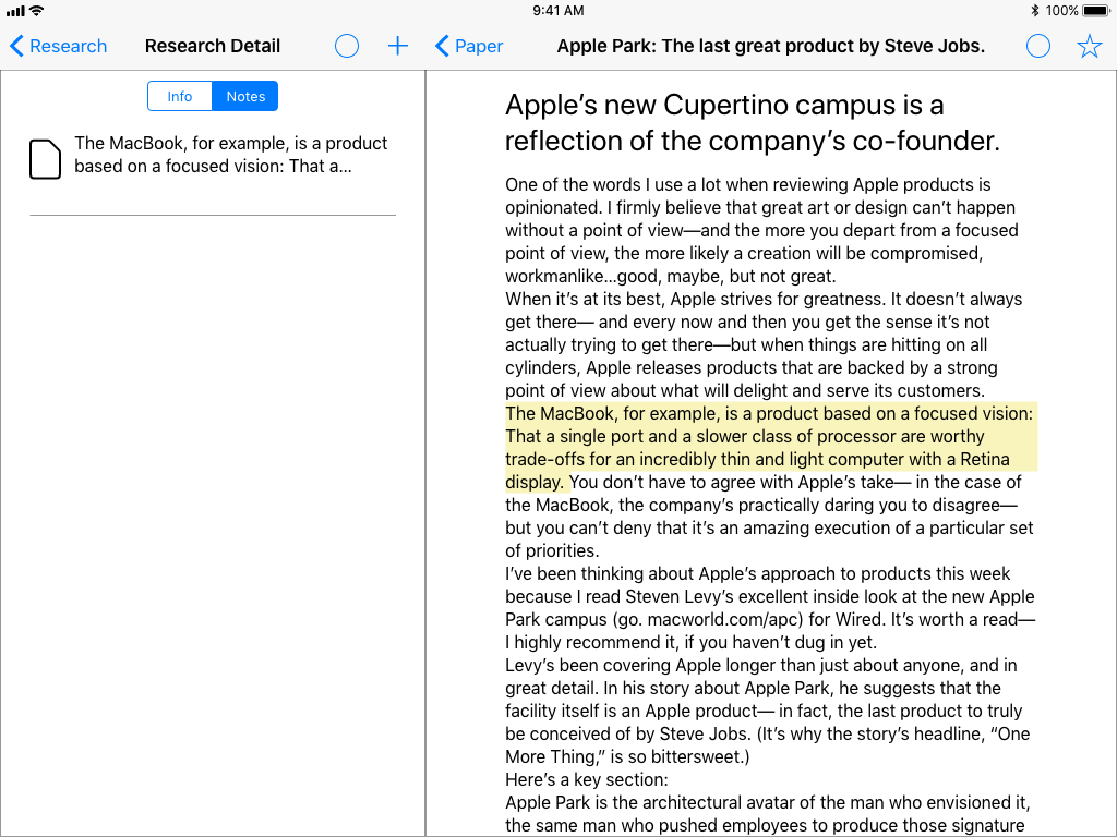
2.2i Highlighted Note: Shows how highlighting a passage adds that passage to notes.
3 Empty Writing Field: In writing mode with an empty paper. The side bar shows a collection of sources that the user has added.
3.1a Article (info): Shows accessing info on an article in the writing mode.
3.1b Article (notes): Shows accessing notes on an article in the writing mode.
3.2a Book (info): Shows accessing info on a book in the writing mode.

3.2b Book (notes): Shows accessing notes on a book in the writing mode
4 Start Writing: Illustrates that as a user starts typing the list of source filter down the most relevant sources.
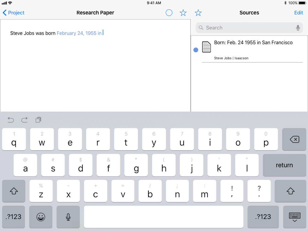
4.1 Cited Text: If there is only one source, or the user selects a source, the text that they are writing becomes associated with that source. This example shows the note added about the book earlier in the flow.
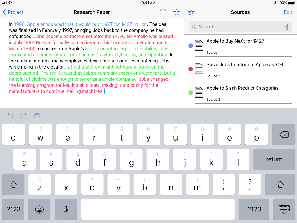
5 Number of Sources: Shows what a paragraph with multiple sources would look like.
6 Highlighted Source: Again, shows how text becomes associated with a source.
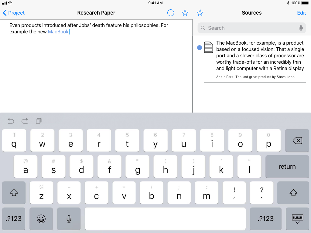
6.1 Highlighted Source: This example is from the text highlighted from the full article earlier in the flow.
Usability Testing
The five big questions going into usability testing were:
1. Whether users would be able to identify the difference between a physical book listing and a full text article. (100% of users could)
2. If users could find how to add a new note to a source. (83% of users could)
3. If users could identify that text could be highlighted. (17% of users could)
4. If users could understand the unified writing and research view if the writing portion was blank. (83% of users could)
5. If users would understand how changes to text would contextually impact the list of sources. (83% of users could)
Conclusion
Because a large portion of the app's functionality relies on contextual responses to user input, the more rigid, snapshot nature of the prototype led to a more guided sequencing for tests that may have impacted the results. I hope that one-to-one feedback (narrowing relevant sources as a user types, highlighting text), and animations (sliding between writing/sources-list and sources-list/ sources-detail views) would help mitigate confusion.
The biggest trouble people had was identifying that the text in the full text of an article could be highlighted to save for later. Having a prototype where the text could actually be selected may have helped with discovery, but not substantially.
While most users were able to identify that the text being typed was associated with the information saved in the notes sidebar, many thought that the written text was a hyperlink to the source. This may have been in part due to the prototype using different colored text to identify the source that the information came from.
While most users were able to identify that the text being typed was associated with the information saved in the notes sidebar, many thought that the written text was a hyperlink to the source. This may have been in part due to the prototype using different colored text to identify the source that the information came from.
One UI element I wanted to see how people would react to, but didn’t design a complete test for, was if people would be thrown off by having the side bar change sides. The was to provide a clear destination between text that they were reading (where the bar would be on the left), and writing (where the bar would be on the right). No one seemed confused by the switch.
Other features suggested by testers:
Version control
Word count
Custom set up per assignment (different than standard format presets)
Word count
Custom set up per assignment (different than standard format presets)
Next Steps:
• Further interface refinements
• Add a highlight tool to the full text view
• Try new ways of visually linking text written about a source to that source in the sources side bar
• Add a simple formatting tools to the writing view
• Add a highlight tool to the full text view
• Try new ways of visually linking text written about a source to that source in the sources side bar
• Add a simple formatting tools to the writing view
Visuals
Concept
As a productivity app with a focus on user generated content the app is designed to recede into the background and let the content stand on its own. Orange was selected as the primary tint color to provide contrast to iOS' default blue to allow for some distinction without diverging too much from the system appearance.
App Icon
The application icon is a combination of an A and the ^ character, used to invoke adding a foot note to a paper.
Iconography
Icons were designed to fit in with the system as much as possible to avoid confusion.

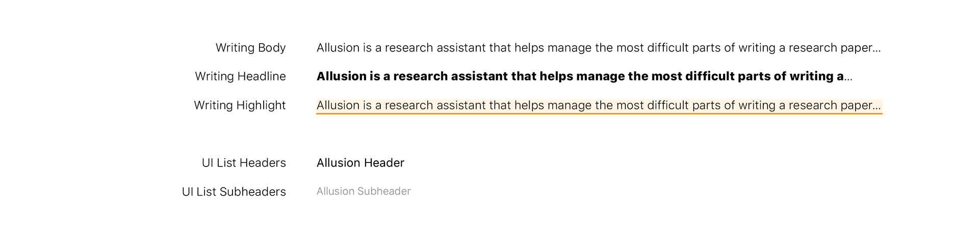
Typography
Similarly to the iconography, the type uses the iOS system San Francisco typeface to avoid dissonance with the rest of the system.
Finial Visuals and Prototype
A higher fidelity prototype with more complete visuals. Because Allusion is a content creation app, there are an infinite number of different paths that a user can take through the app. As a result the following prototype is more "on rails" than the final would be.
Check out the full prototype bellow: